Your cart is empty
Keep ShoppingDesign Trends We're Loving

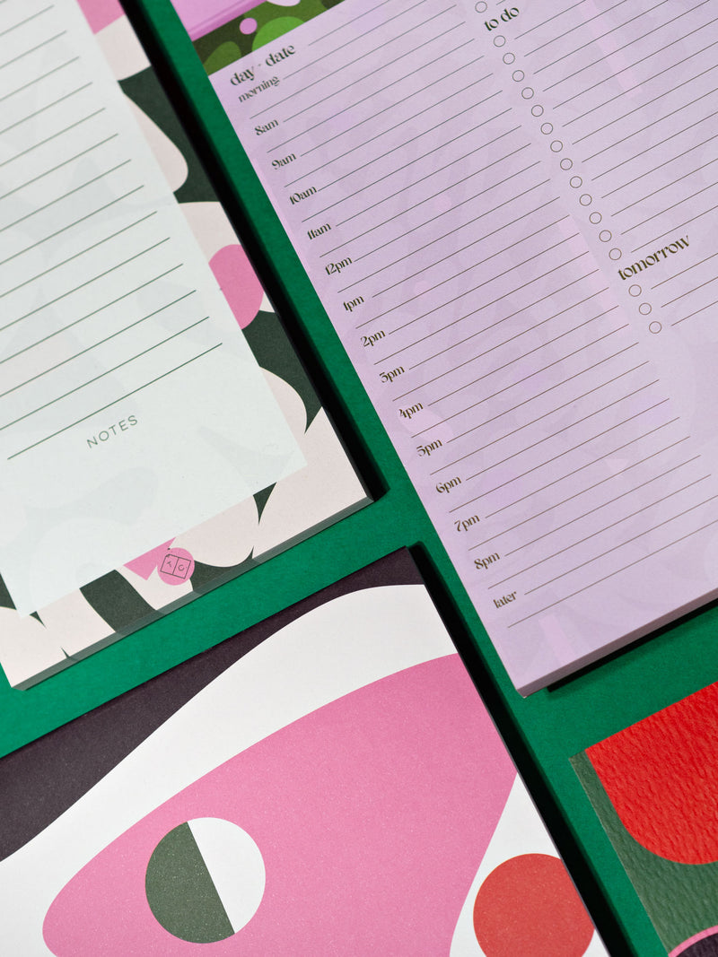
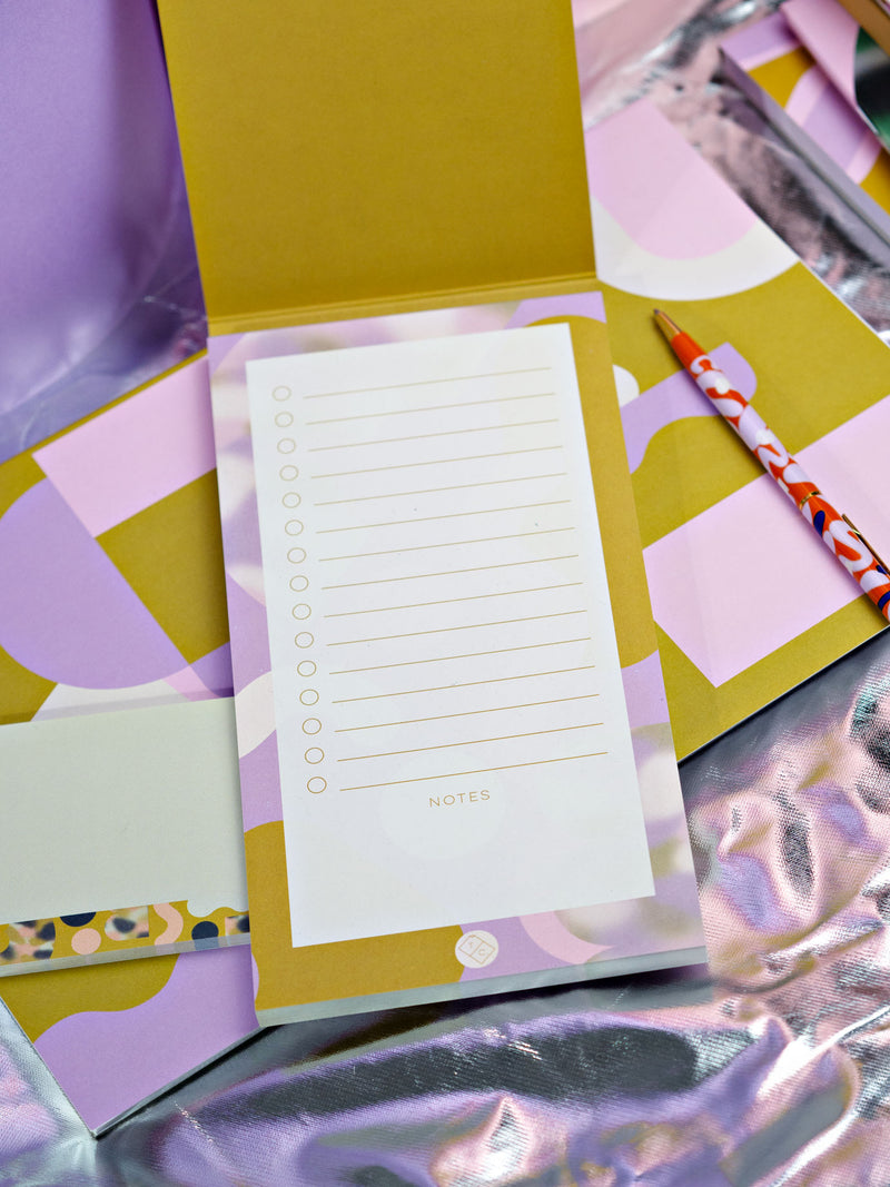
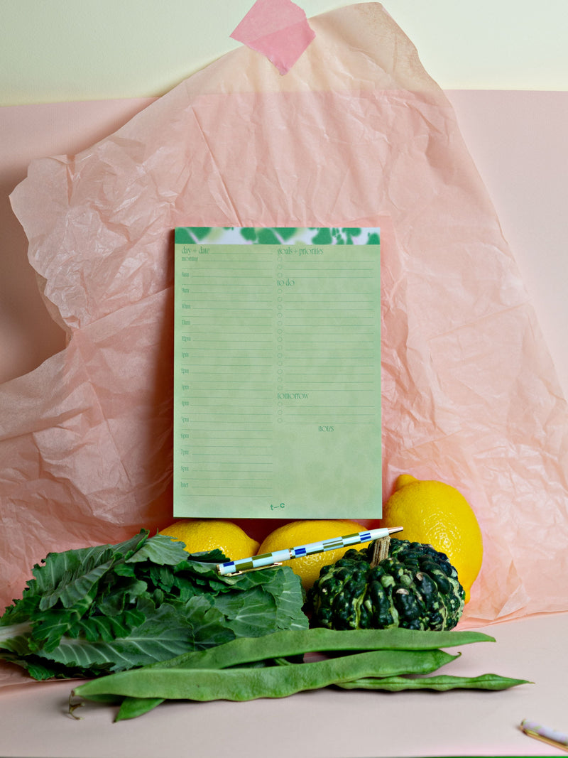
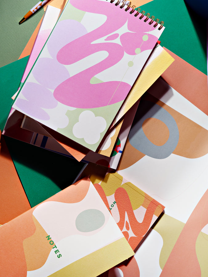
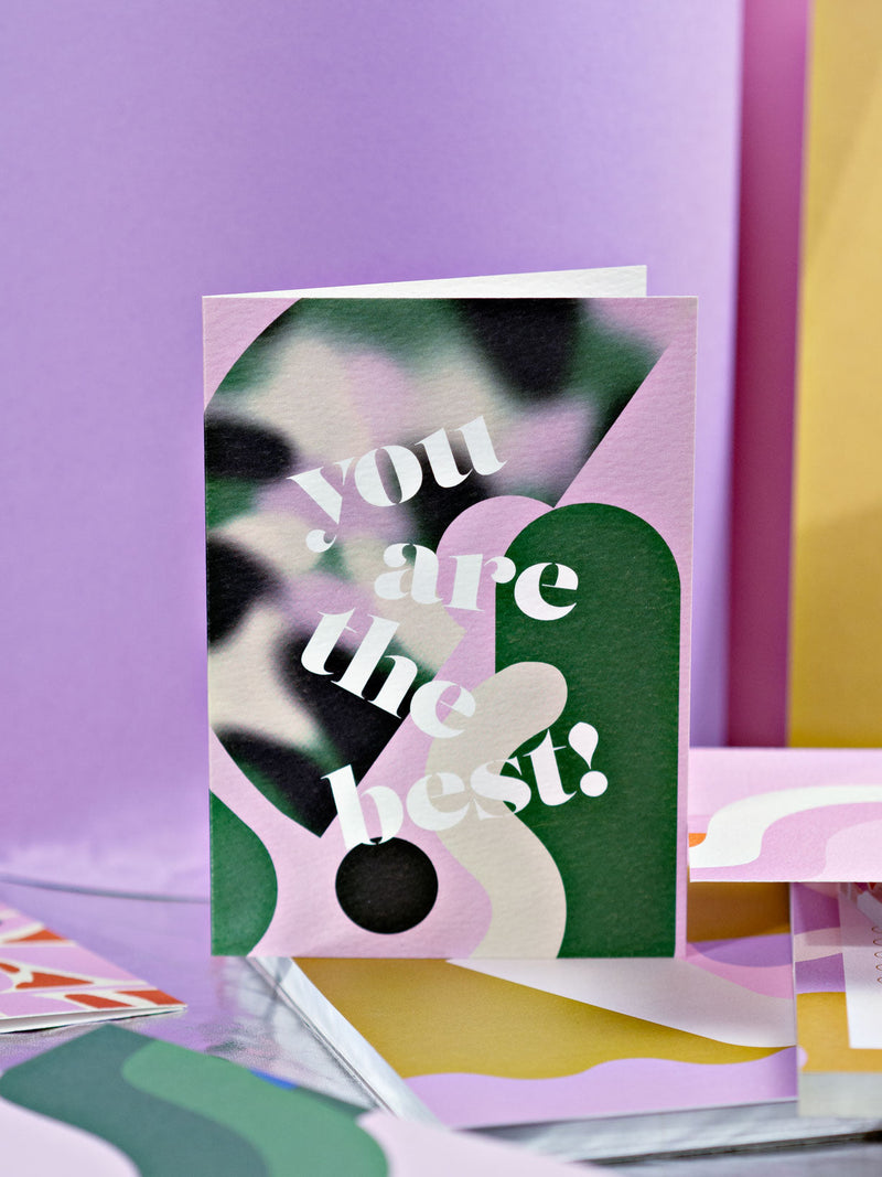
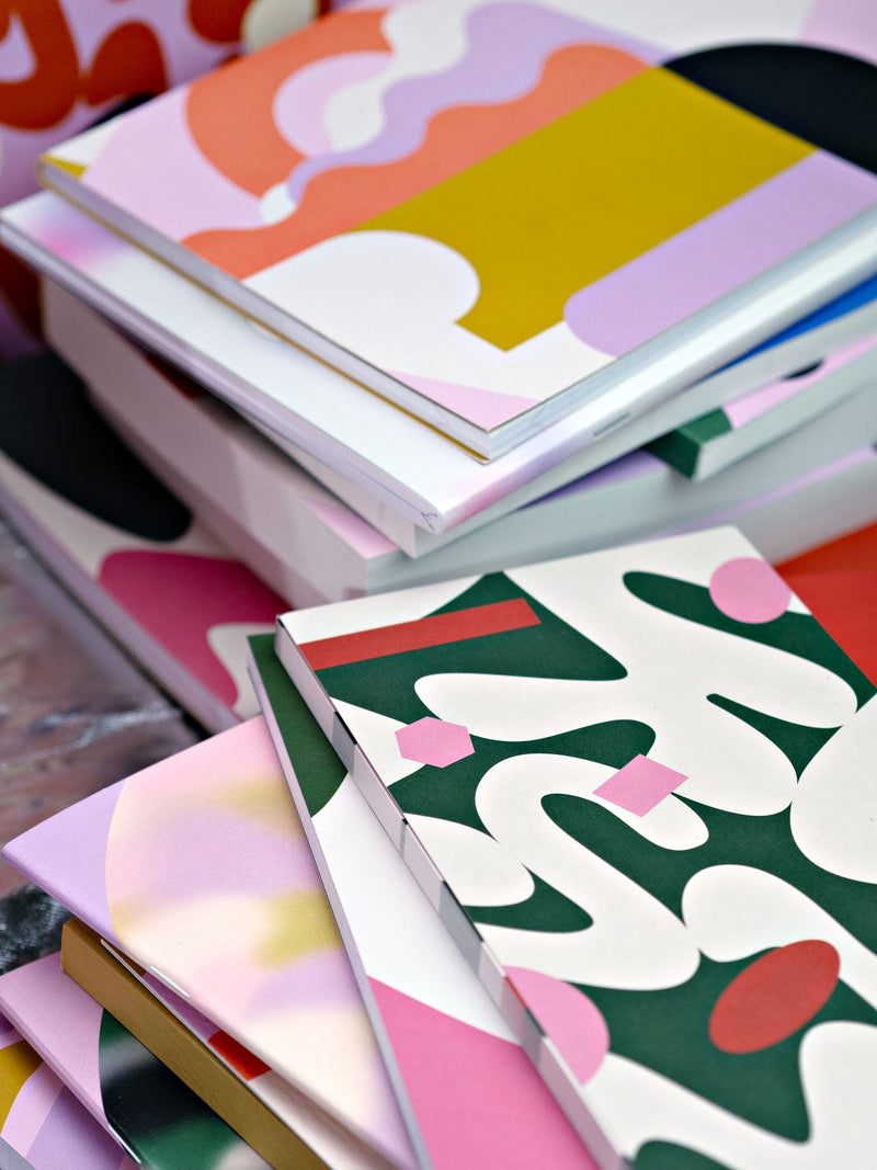
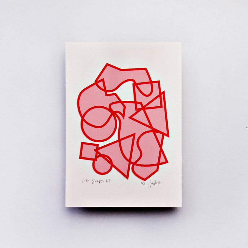
When we planned this post, it was originally going to be a roundup of the best stuff we saw on our trade show travels but... well we all know how that's going at the moment! But don't worry, we’re always on the lookout for design inspiration – this means when it comes to designing new collections, we’re not starting from square one. We’ve always got a good design inspo-related board on the go! So, as our latest collection has just launched, we thought we'd rework our original idea for this month and instead share some different trends we're loving and that have been super influential for us.
1. Unexpected Terrazzo
Terrazzo is always a go-to for us – a Completist staple. You’ll always see it somewhere in every collection we launch. I personally remember being fascinated with terrazzo tiles in the big shiny new shopping centres opened in Australia in the early 90’s as a child (yep, Aussie here! Old enough to remember the last terrazzo craze!)
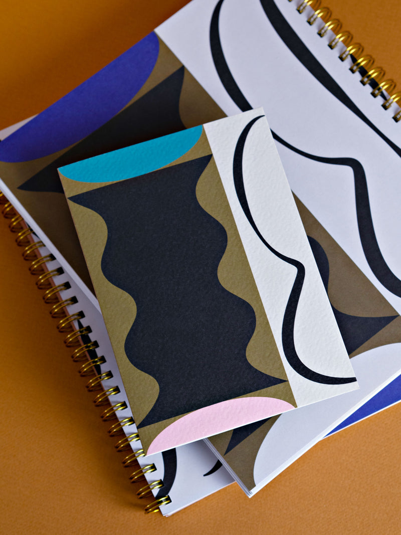
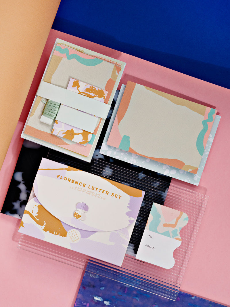
Terrazzo print is a classic, but we’re always looking for ways to make it feel new. We’re loving the bold, statement terrazzo in many home and interior pieces at the moment (we’re personal fans of Dzek, and can’t get enough of the Olivia Aspinall tabletops on the 2LG Studio instagram). We would cover our whole house in terrazzo if we could! But stationery-wise, we’re actually loving a bit of unexpected terrazzo. What does that mean? The usual cards and notebooks but with more abstract shapes of terrazzo print, and hints of terrazzo mixed in with other prints. A dusting of terrazzo, if you will. It’ll always be there (we just can’t help ourselves!) but this time around we’re loving it as a subtle backdrop to the other things.

2. Hyperreal Colours and Florals
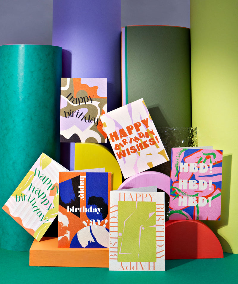
Acid colours and oversaturated bursts? Yes please! We have been loving hyperreal colours and in particular, florals. Our Botanic board on Pinterest is one of those above mentioned ones we’re constantly adding to – check it out here.
We LOVE everything from Brrch Floral (thanks Squarespace ads on Youtube for that discovery – see, inspiration everywhere!) The collaborations and shoots she has produced are stunning. The colours are so vivid and exciting, you feel like you are in a surreal, almost sci-fi fantasy world.

3. Collage
If you’re thinking scrapbooks and old newspapers, stop and hear me out. Collage is amazing, and we’re constantly inspired by it. Go to almost any artist’s retrospective and you’ll see they’ve probably played with it at some point or another. The collages by Lee Krasner at her retrospective last year at the Barbican were great from a colour perspective (but what of her work wasn’t!) What we’re really loving and seeing loads of is more the Andy Warhol type of collage – the Mick Jagger portraits are a perfect example: a base of different coloured materials stuck together, and then screen printed portraits over the top. This kind of thing has been really influential for us this season, and continues to be. We think it’s a nice move-on from the ubiquitous female line drawings everyone loves so much, and a nice way to add a pop of colour to an otherwise quite minimal style. We definitely think you’ll be seeing more of this coming through, especially in fashion textiles (which are also always a good inspiration source for us!)

4. Miami-inspired
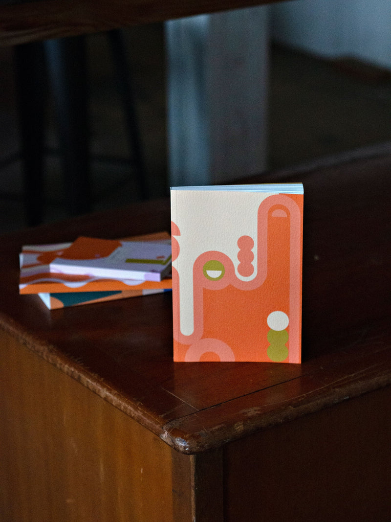
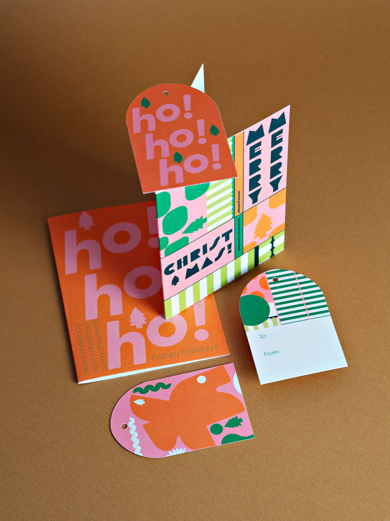
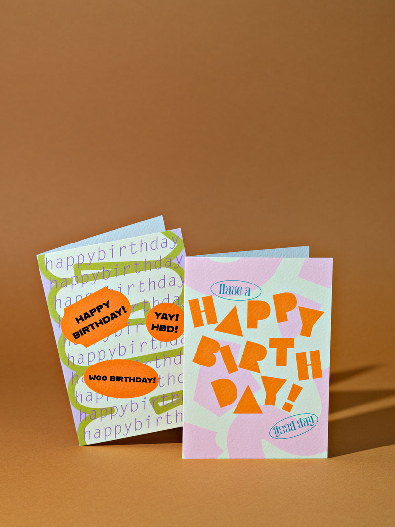
There is something so optimistic about quintessential Miami architecture, and we could all use a bit of visual optimism right now! To be honest, Miami is one we’ve seen influencing product and interior design for quite a while and continues to be a big one for us too. If you’re not quite up for committing to the full Memphis-inspired aesthetic, then Miami is your friend. The designs themselves tend to be pretty simple; the colour combos are anything but. We can’t wait to visit Miami one day, but until then, we’ll be drooling over architecture books and watching The Birdcage on repeat.
Click through to see all our Miami-inspired product
5. Pattern Clash
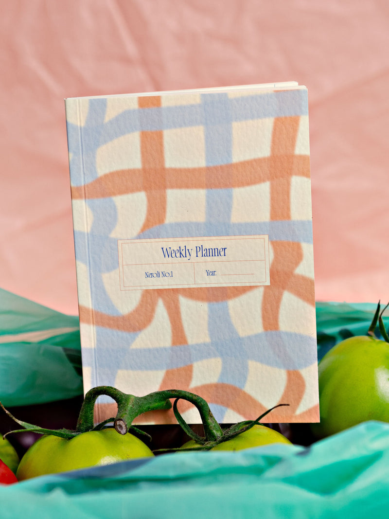
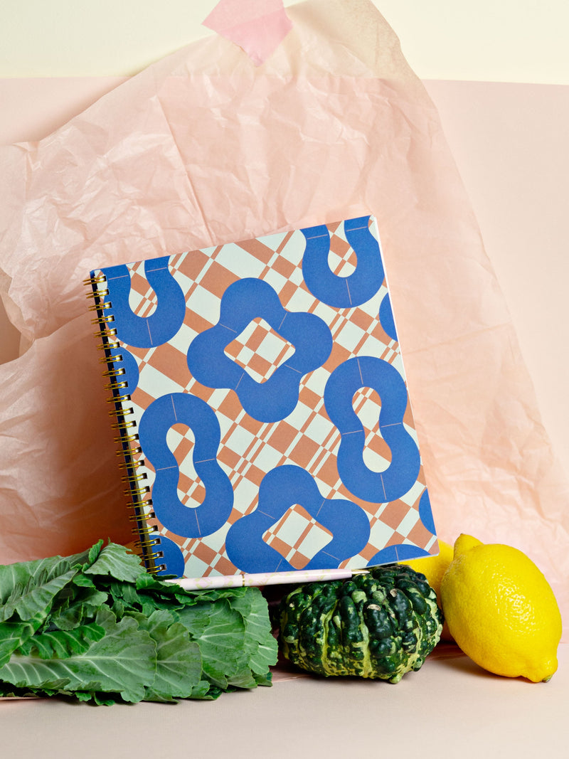
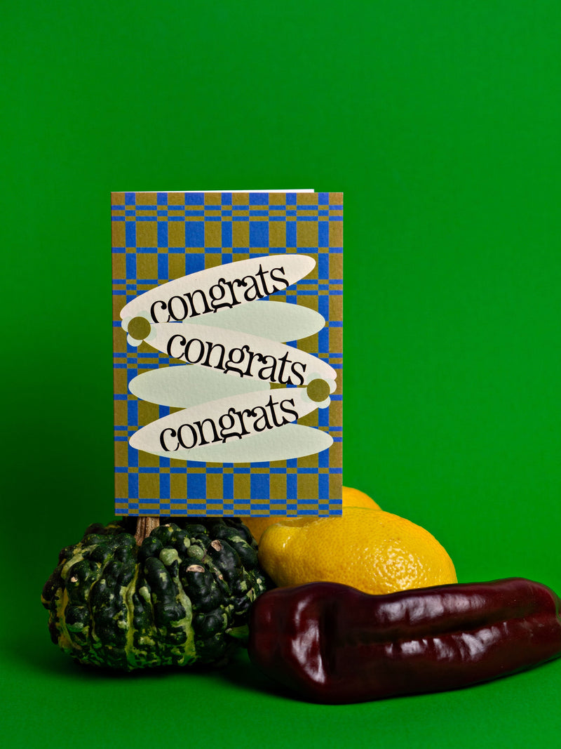
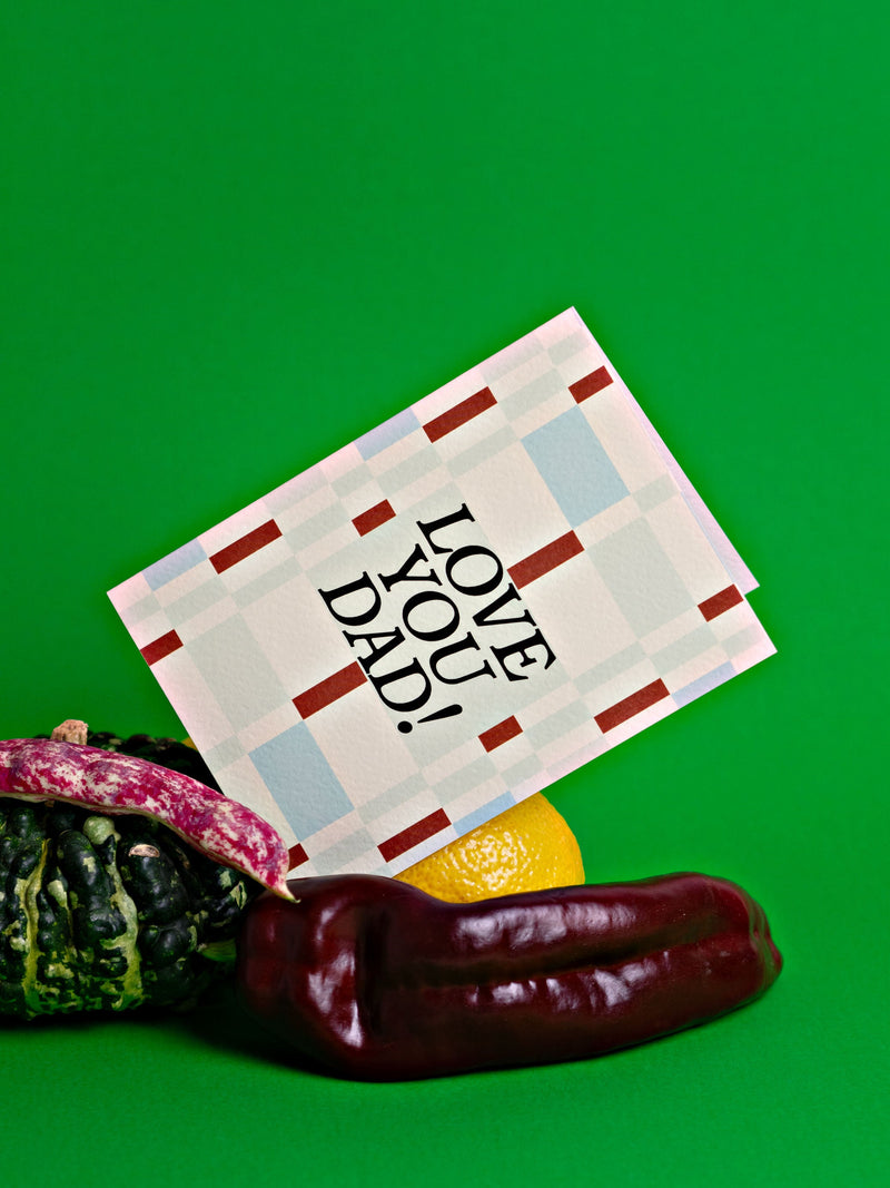
Pattern clash has been happening for a while in fashion (hello Rixo, Ganni, and pretty much any street style pic you can find) but for stationery it’s feeling quite fresh and new. We find stationery consumers on the whole tend to prefer more classic and simple designs, but if you’re here then you know we’re not really known for those things. We love a bit of pattern clash! And we think you’re going to see lots more classic prints mixed together to create something that feels a bit newer. We’ve tried a few iterations (and it was sometimes a bit too much!) but we think you’re going to love our check mix print. And if you’re a bit unsure, then let the master of pattern clash, Dries Van Noten be your guide.
- Jana


